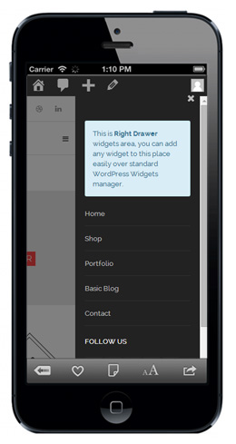
Montana targets the Mobile
Montana is Mobile Device oriented. It can automatically adapt to many screen sizes. Since Revolution Slider is also responsive, your banner slideshows would also be functional on various tablet and smartphone screens.
Every one of its Sidebar will collapse when there is no widget inside, allowing Montana based websites to save as many displaying space on customer’s screen as possible.
Montana Top Menu will also be automatically turned into an Off Canvas Menu when the screen is narrow enough, making Montana features 3 Off Canvas Menus totally on a narrow mobile screen.